Think about the last app you deleted. Maybe it was slow, or you couldn’t find the one button you needed. Maybe it asked for too much before showing you anything useful. You didn’t write a complaint. You just tapped “Uninstall” and moved on.
That’s the reality of mobile app design. Users don’t give second chances. A good design makes an app feel easy, almost invisible. A bad one makes people leave within seconds.
Whether you’re a small business owner planning your first app or a marketer trying to understand why your app isn’t getting downloads, this guide will help. No jargon, just what works.
Table of Contents
What Is Mobile App Design, Really?
Mobile app design is the process of deciding how an app looks, feels, and behaves on a phone. Many people think it’s only about colors and pretty screens. That’s just one part.
Good design answers simple human questions:
- Can I figure out what to do without being taught?
- Does this app respect my time?
- Do I feel confident using it?
Design is made of two things working together: UI (User Interface), which is what you see, like buttons, icons, fonts, and colors, and UX (User Experience), which is how it feels to use, like how easily you move from opening the app to getting what you came for.
A beautiful app with confusing navigation fails. A plain app that does its job smoothly often wins. The best apps manage both.
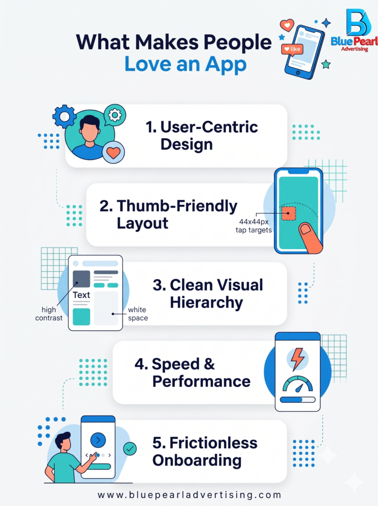
Start With People, Not Screens
The biggest mistake businesses make is jumping straight into designing screens. They open a design tool, pick colors, and start drawing before asking the most important question: who is this for?
Take a moment to think about your users. A grocery delivery app in Moradabad serves a very different person than a stock trading app in Mumbai. One user may be a homemaker checking her phone between chores. The other may be a young professional on a fast connection. Their habits, patience, and expectations are completely different.
Before design begins, find out:
- Who will use the app? Age, language, comfort with technology.
- What problem does it solve? One clear problem beats ten vague features.
- Where will they use it? At home, in a market, while traveling?
When you design for real people, the decisions get easier.
Keep It Simple (Harder Than It Sounds)
Every extra button, banner, and pop-up fights for attention. When everything is shouting, nothing is heard.
Simple design means:
- One main action per screen. If the goal is “Book Now,” make that button impossible to miss.
- Plenty of white space. Breathing room helps the eye rest and helps users focus.
- Short, clear text. “Get Started” works better than “Initiate Your Onboarding Journey.”
- Familiar patterns. People already know how a bottom navigation bar and a back arrow work. Don’t reinvent them just to look different.
A good test: hand your phone to a friend, say nothing, and watch them use the app. Where they hesitate is where your design needs work.
Design for Thumbs, Not Mice
Phones are held in hands, and most people use one thumb. This changes everything.
Important buttons should sit within easy reach, usually in the lower half of the screen. Tap targets need to be big enough that nobody hits the wrong thing by accident. A good rule is at least 44 by 44 pixels for anything tappable.
Also remember that screens come in all sizes. Your app should look right on a small budget phone as well as a large flagship. In India especially, a huge number of users are on affordable Android phones, so test on them, not just on the latest device in your design studio.
Colors, Fonts, and Feelings
Color isn’t decoration. It sets the mood. Blue often feels trustworthy, which is why many banking apps use it. Green suggests growth and freshness. Red creates urgency, so use it carefully.
A few practical tips:
- Choose a small palette, with one main color, one accent, and neutral shades.
- Make sure text is easy to read against its background. Light grey on white looks stylish but frustrates real people.
- Stick to one or two fonts. Too many make an app look messy.
- If your audience speaks Hindi or other regional languages, check that your design works well in those scripts too.
Your app’s look should also match your brand. If someone sees a screenshot without your logo, they should still feel it’s yours.
Speed Is Part of Design
Many people forget this: slow is a design flaw. If your app takes five seconds to load, users feel it as bad design, no matter how nice it looks.
Use light images, simple animations, and loading indicators so people know something is happening. Think about people with weaker internet connections too. An app that works smoothly on slow data earns real loyalty.
Make the First Minute Count
First impressions in an app happen fast. Onboarding, the first few screens a new user sees, can make or break everything.
Don’t force sign-ups before showing value. Let people look around first. Don’t throw five tutorial screens at them. Show, don’t lecture. If you need permissions like location or notifications, ask at the moment they make sense, not all at once on launch.
Accessibility Isn’t Optional
Millions of people have visual, hearing, or motor difficulties. Good design includes them. Use readable font sizes, strong contrast, clear labels for buttons, and support for screen readers.
This isn’t just the right thing to do. It also makes your app better for everyone. Ever tried reading your phone in bright sunlight? Good contrast helps you too.
Test, Listen, Improve
No designer gets it right the first time. The smartest teams build a simple prototype, put it in front of real users, and watch what happens. They listen without defending their choices. Then they fix and test again.
After launch, the work continues. Look at where users drop off, read reviews, and keep improving. The best apps are never “finished.”
Common Mistakes to Avoid
- Copying a competitor without understanding why it works for them
- Packing too many features into version one
- Ignoring Android because the team uses iPhones
- Skipping testing to save time
- Designing for the founder’s taste instead of the user’s needs
Final Thoughts
Great mobile app design isn’t magic, and it doesn’t need a giant budget. It comes from respecting your users: their time, their attention, their abilities, and their patience.
Keep it simple. Make it fast. Test with real people. Listen to what they tell you, in words and in behavior.
If you do that, your app won’t just get downloaded. It’ll get used, recommended, and kept on the home screen, which is where every app wants to live.
Planning an app or need help getting it in front of the right audience? Blue Pearl Advertising Agency can help you build and promote it.



Leave a Reply